i. A logo that tells a story
The logo is a rustic, simplified take on the heritage plaques found on Strathcona’s homes. Its clean, yet rugged design reflects the neighbourhood’s history while capturing its gritty yet charming character.
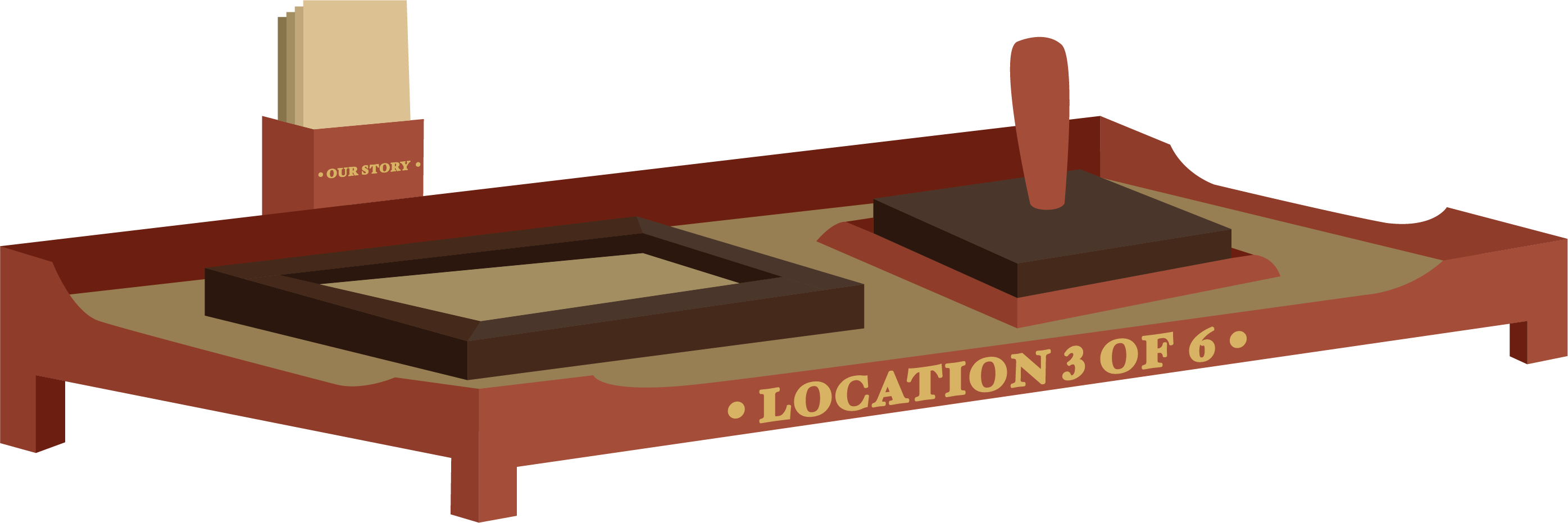
ii. Simple Stamping Stations
Inspired by layered stamps seen in shrines within Japan, the stamp card is designed so that whatever route the user chooses to take, they can fill out the stamp card, creating a representation of the neighbourhood. Each one of the stamps is an illustrative representation of every location they visit.
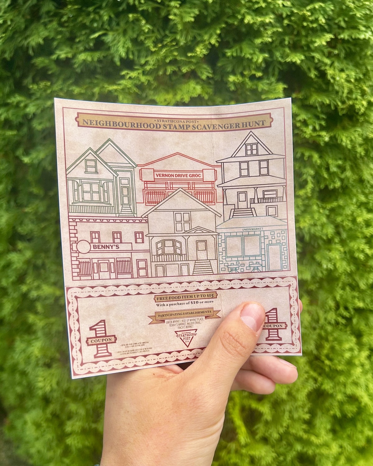
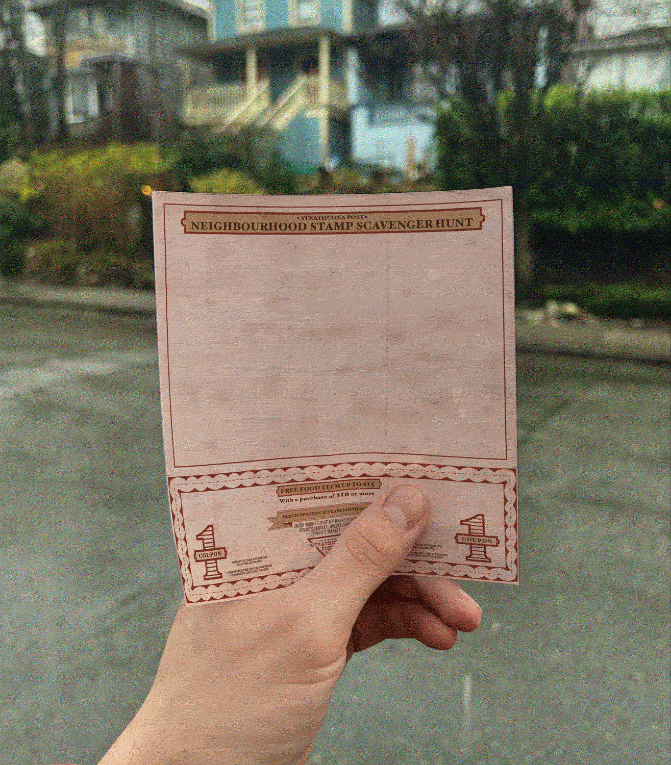
iii. Stamp Cards
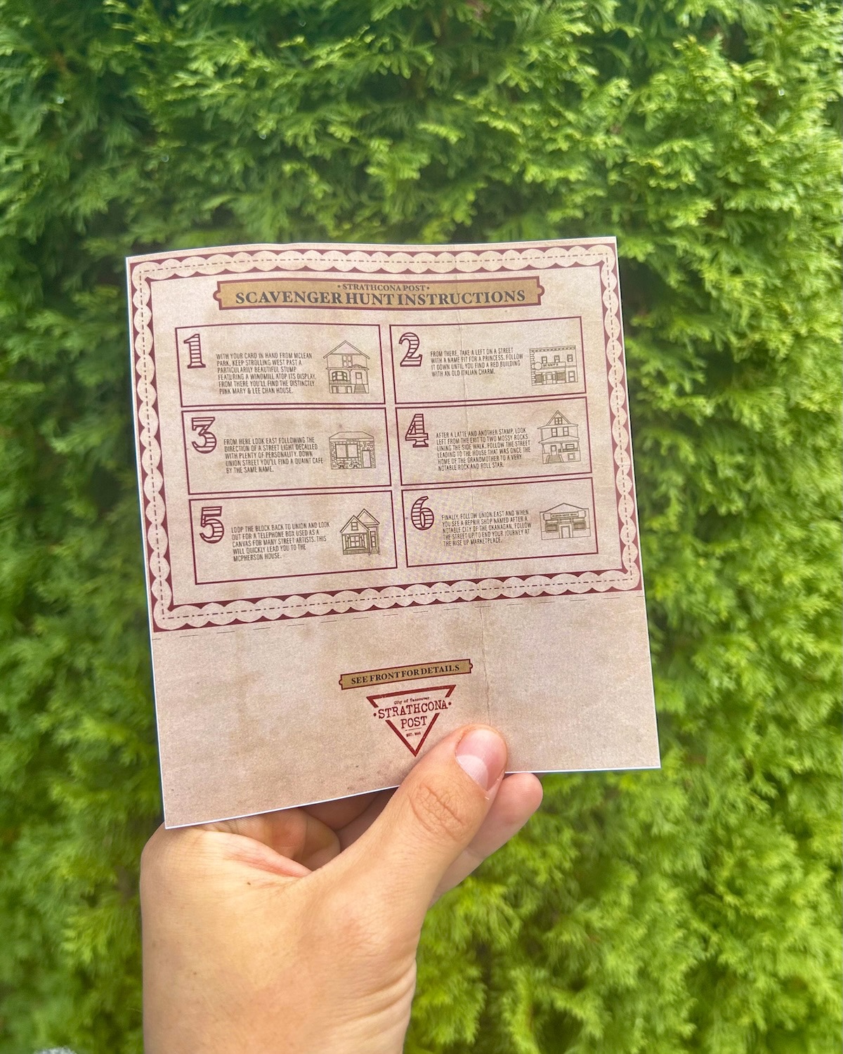
While the front features the stamp card and coupon, the back features instructions leading the user through the neighbourhood without revealing too much. Even if you get lost, you could always pull out your phone. However, the hope is that this activity gives you an opportunity to disconnect for a little while and smell the roses.
iv. Social Media
The social media reel brings Strathcona’s history to life, featuring preserved heritage and figures like Nora Hendrix’s house—Jimi Hendrix’s grandmother, where Jimi once spent his summers.
The main character was illustrated in Illustrator and animated in After Effects, where refining the walk cycle taught me the essentials of motion design.
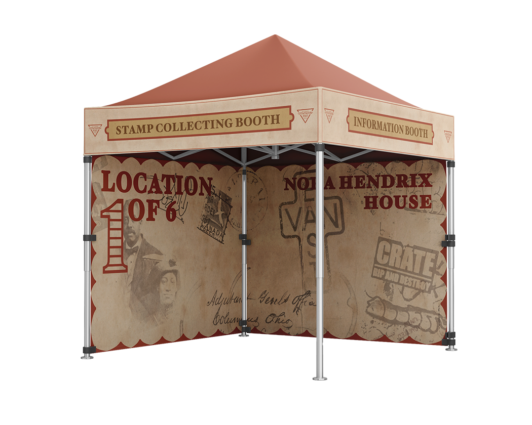
v. Booths
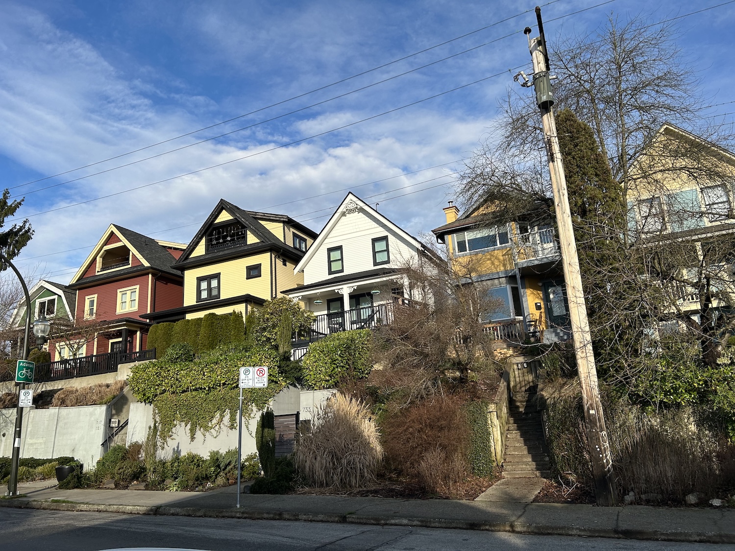
Stamping stations are placed at key businesses, while heritage homes have special plaques. Weatherproof booths on nearby corners handle the stamps, respecting homeowners’ privacy.
After stamping, staff share each home’s history, allowing visitors to appreciate it without crowding or blocking the yard.