i. A logo and a tool
The logo takes the imagery of a beer tap and creates a text-based logo with hand-done type to create a logo that could also work as a physical beer tap to be implemented in other breweries.
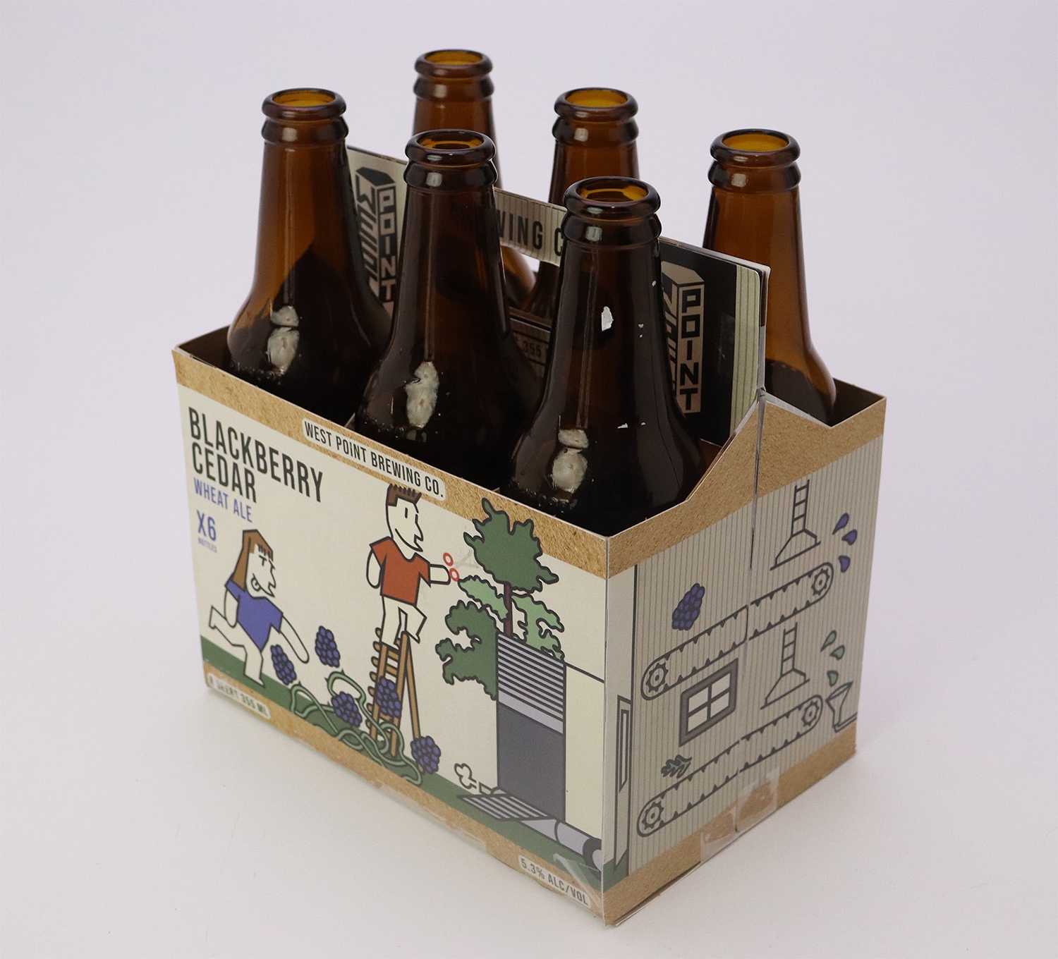
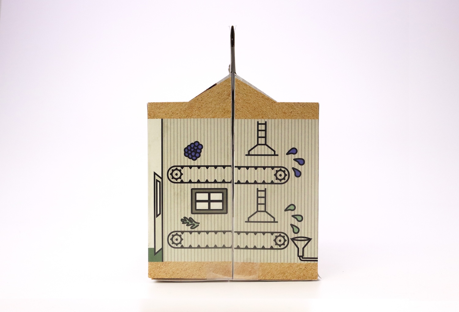
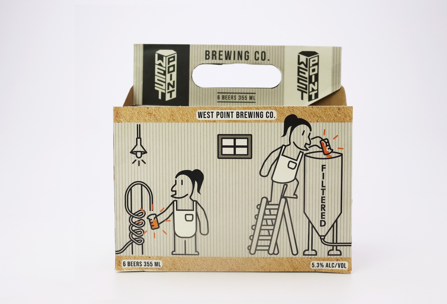
ii. packaging with purpose
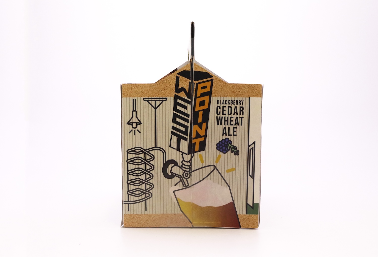
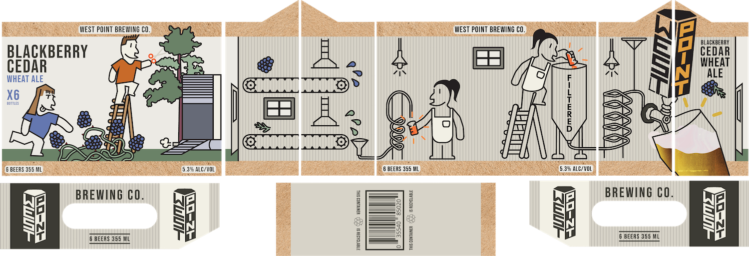
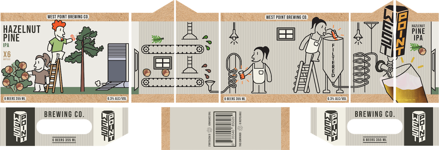
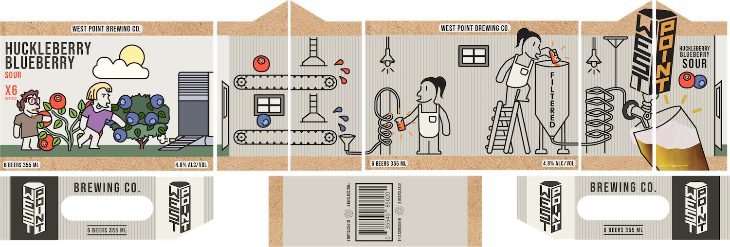
With West Point Brewing’s unique brewing process, my favorite concept was merging the process and packaging into one cohesive idea. Each package features playful illustrations transitioning from corner to corner, showing BC ingredients’ journey from forest to beverage in a unified, story-driven design.
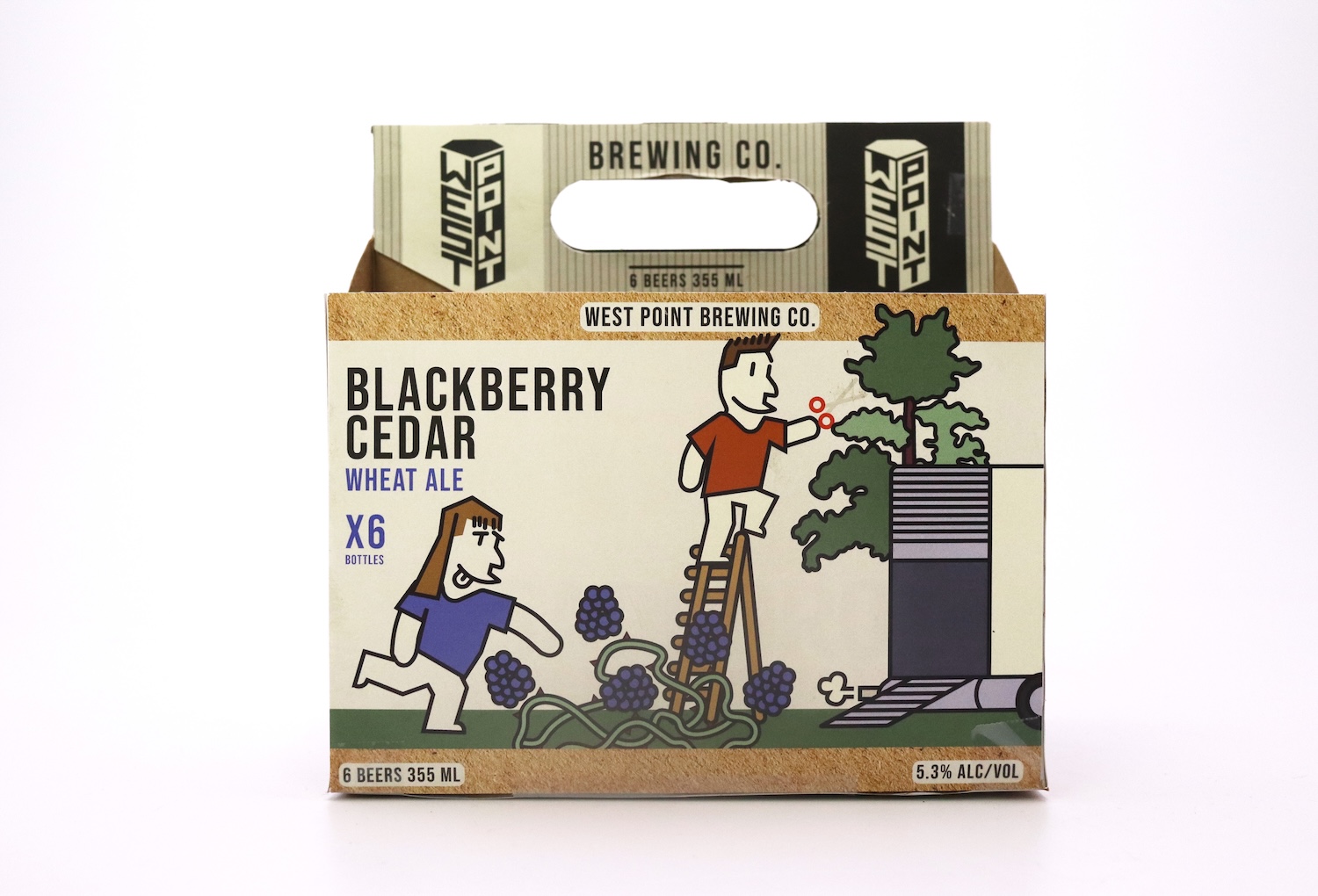
iii. 3 Distinct Flavours
I made a series of three different beverage packaging sets, but the front cover varies in order to have distinct front-facing packaging to distinguish between the different beverages.
iv. Bottles to match
For the bottles, I wanted to keep the labels consistent with the appearance of the packaging, consistent in style, but distinct by a range of colours that could be applied to a myriad of drinks.
Social media these days is by far the most effective way to reach a targeted, but massive audience easily and get the most eyes on an expanding business.
v. Social Media motion reel
To tie it all together, I produced a social media reel showcasing the brewing process and brewery locations, formatted for Instagram, TikTok, and YouTube Shorts with safe margins for on-screen text.
These days, social media has become the most effective way to reach a large, targeted audience and grow brand visibility.