i. Logo development
The logo is friendly and playful, with a rough wordmark highlighting the brand’s natural focus. It balances approachability for the target audience with appeal to hospital distributors buying in bulk.
ii. 3 Themes to tell endless stories
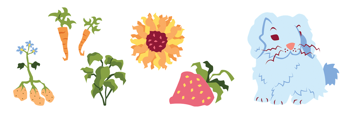
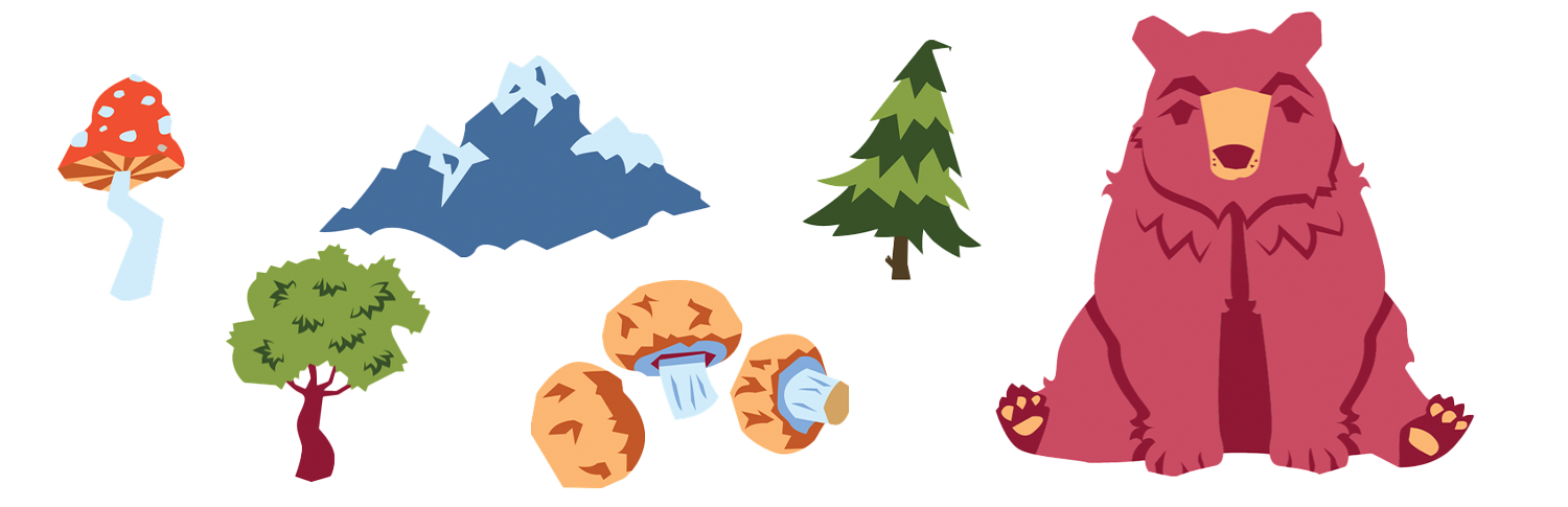
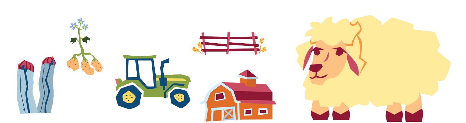
Illustrations were designed for three distinct themes including garden alongside a bunny, forest with a bear, and farm with a sheep. Each theme has a series of designs you would see in that environment alongside an animal pal.
iii. Along with a story of how they came to be
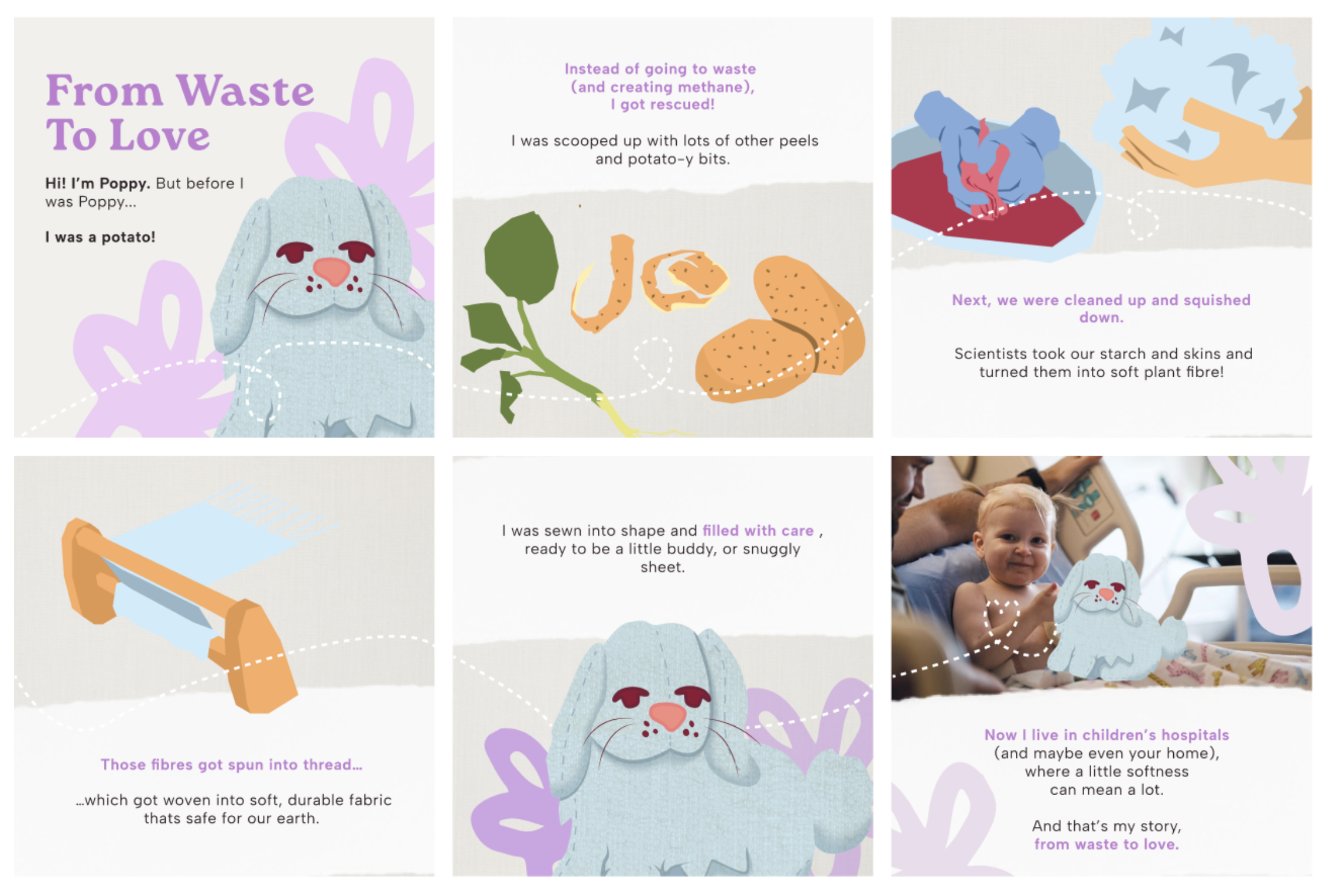
We thoroughly researched the newly discovered process of turning potato fibres into textiles, and I made illustrations to demonstrate the step-by-step process of converting food waste into textiles.
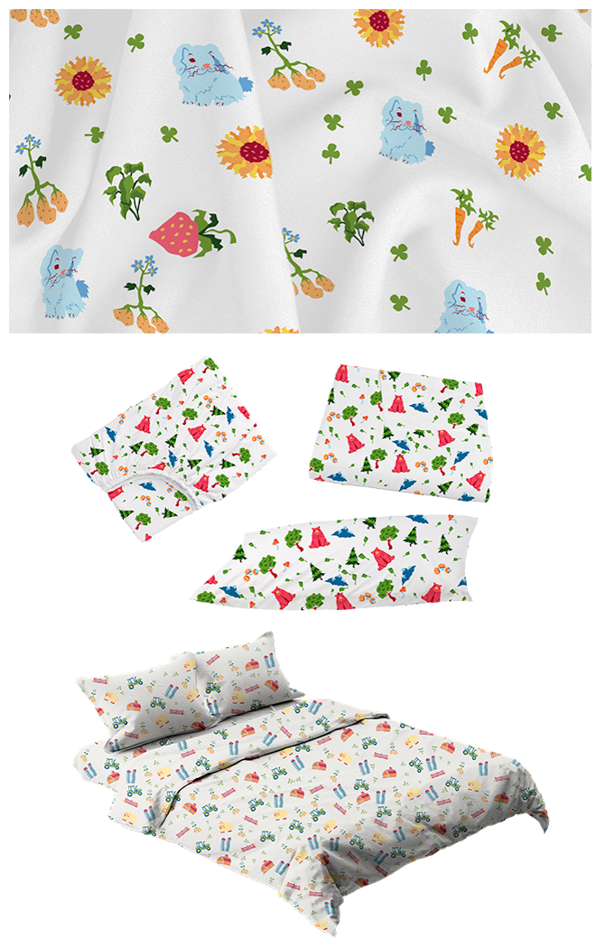
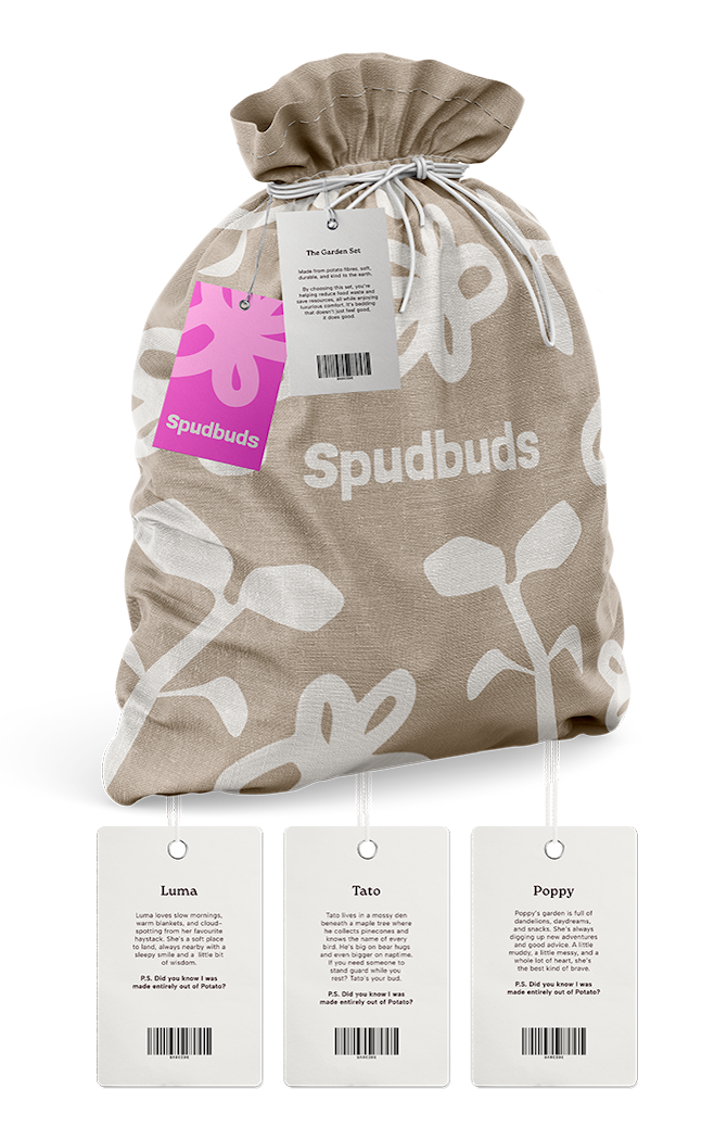
iv. Patterns, Products & Packaging
From the illustrations, we made patterns that were applied to all the necessary bedding products. The versatile patterns could be used for hospital gowns, apparel, and other products.
Finally, to seal the deal, potato burlap sack styled bags can fit entire bedsets alongside stuffed animals with a hang tag to tell the story of our furry friend.
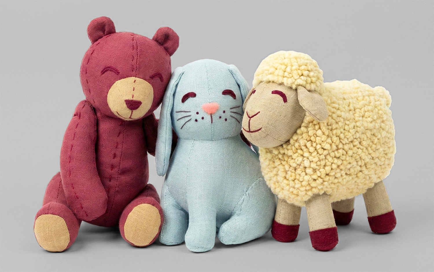
v. Stuffed Animals to match
Each stuffed animal is made entirely from potato waste, from stuffing to the furry outside. Take that care home with you at the end of your stay at the hospital, and have the buddy that kept you company in your hospital bed do the same for you at home.