i. Improving without erasing
Frank’s logo has subtle charm—like the symmetrical ‘dH’—but since it’s “Frank’s” RedHot, it needed a more personal script-style font to reflect its handcrafted roots and the name itself. I refined the kerning and added a flame to the ‘o,’ giving it character without losing simplicity.
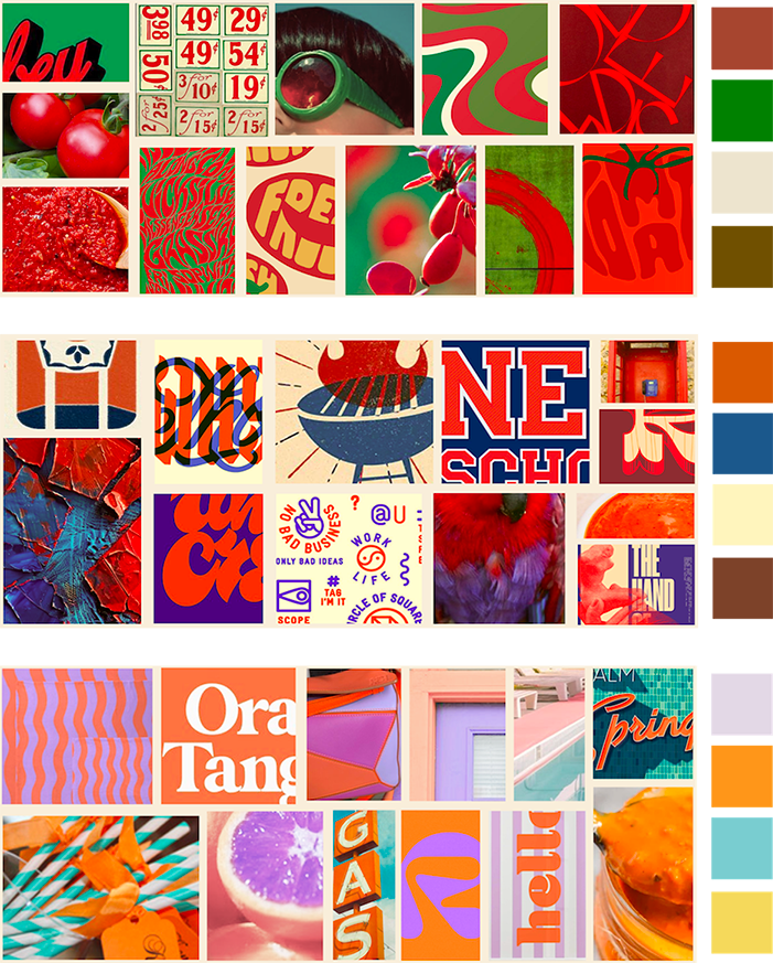

ii. more than one direction
By cropping down images to a tight angle and combining a refined colour palette, I made three solid directions for the brand to go in. While some shouldn’t stray too far from the brand’s current vision, it never hurts to present ideas that are outside of the box with a solid vision to back them.
After review, we settled on the ‘Bold’ look for the final colour scheme and the branding for Frank’s new appearance.
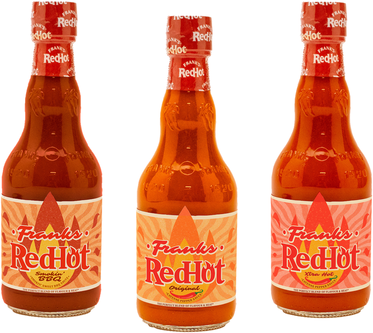
iii. The New Bottles
For the bottles, I refreshed core elements and developed three concepts adaptable across Frank’s full product line.
To express heat and flavor, I set the wordmark in a bold flame graphic, using subtle texture instead of dated effects for a modern, heritage-inspired look.