i. brand guide
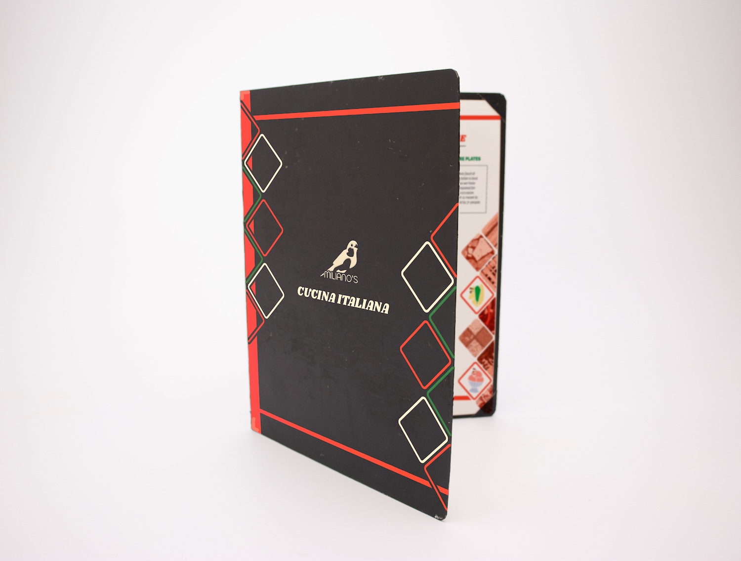
The logo, featuring the national bird of Italy, the Italian Sparrow, is a very social bird. The logo represents tradition, while emphasizing the all-inclusive social aspect that makes Miliano's truly special.
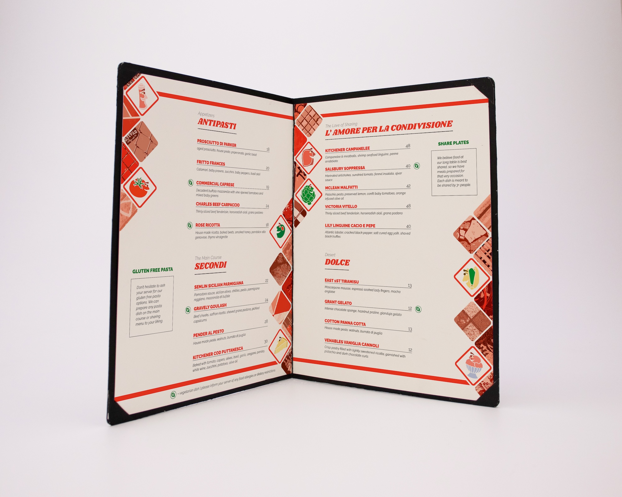
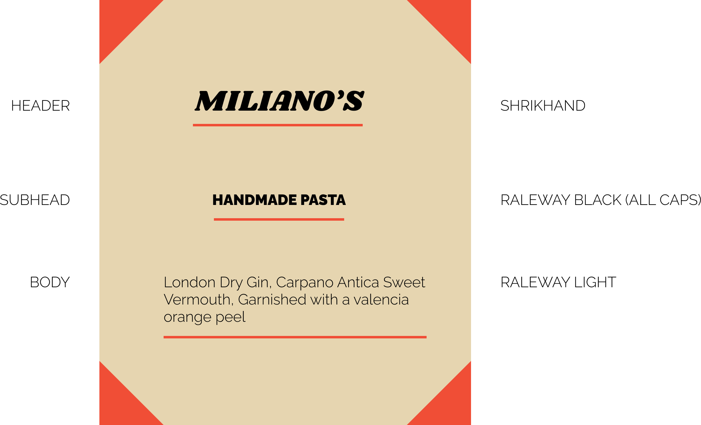
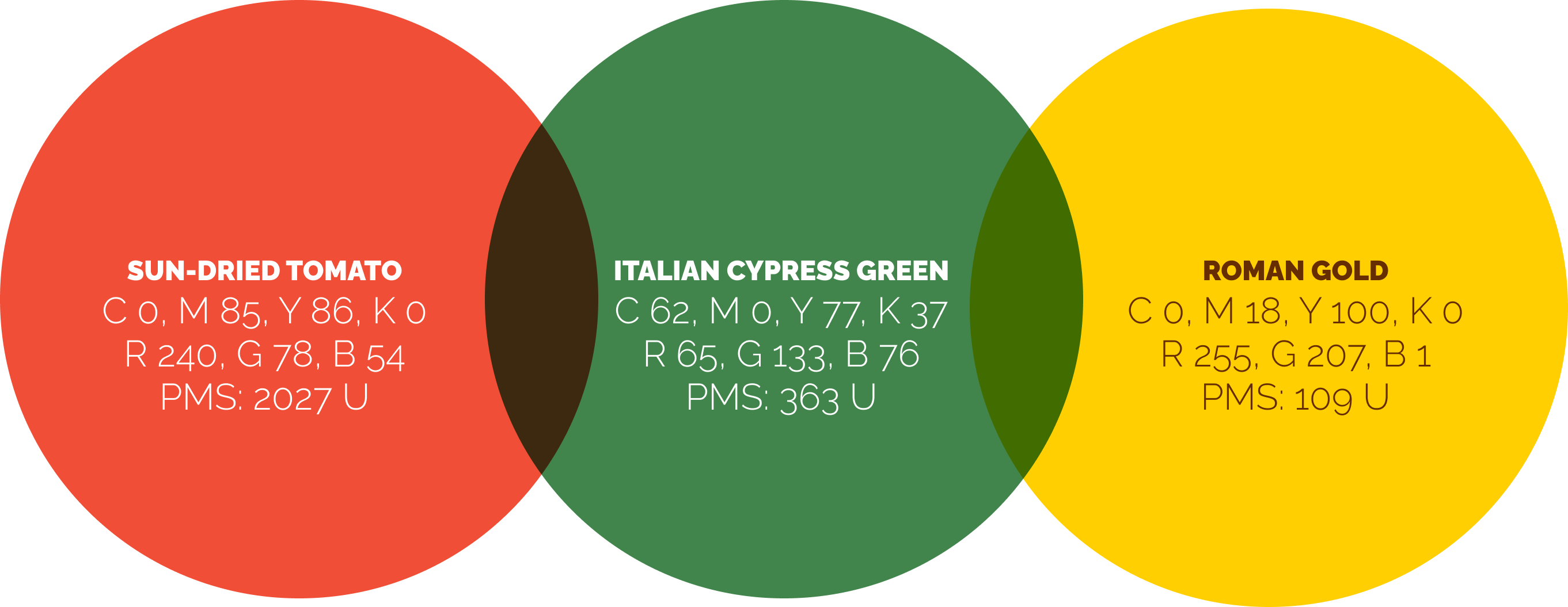
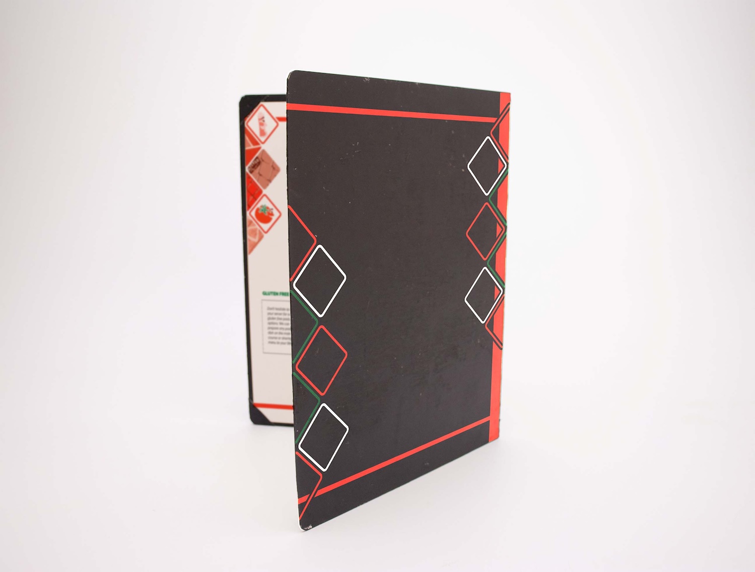
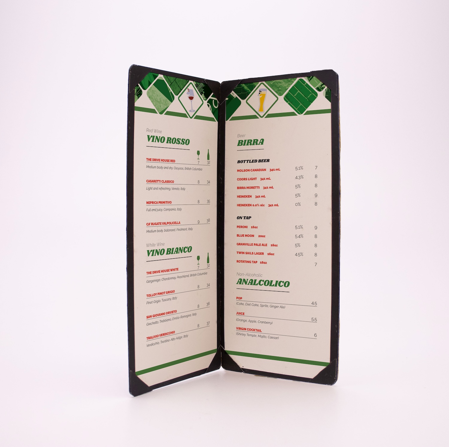
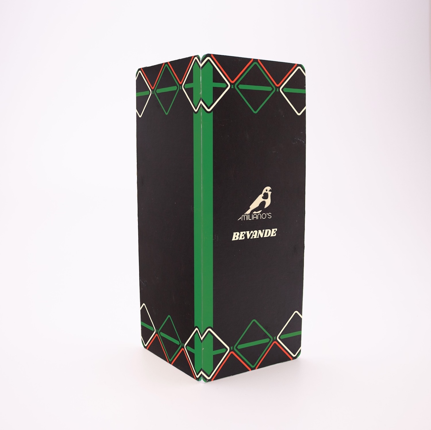
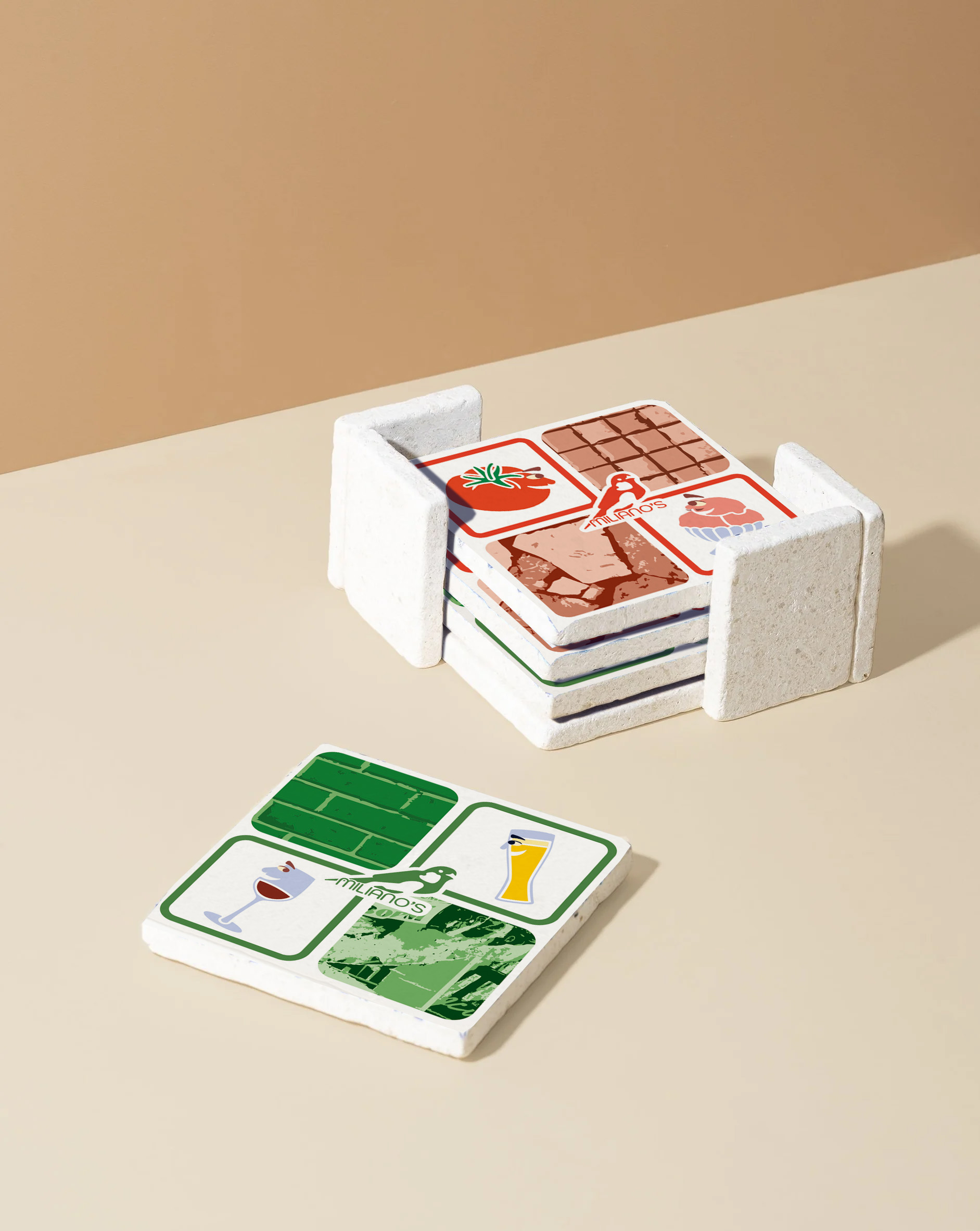
ii. mosaic style menu
The menu uses Italian mosaic tile shapes with graphic textures from photos taken on Commercial Drive. Every wall, brick, and mural is reflected in the design, with each menu color-coded for easy distinction. Brand characters appear throughout, representing specific dishes.
All food items are named after streets on ‘The Drive,’ celebrating the area’s people, homes, and community spirit.
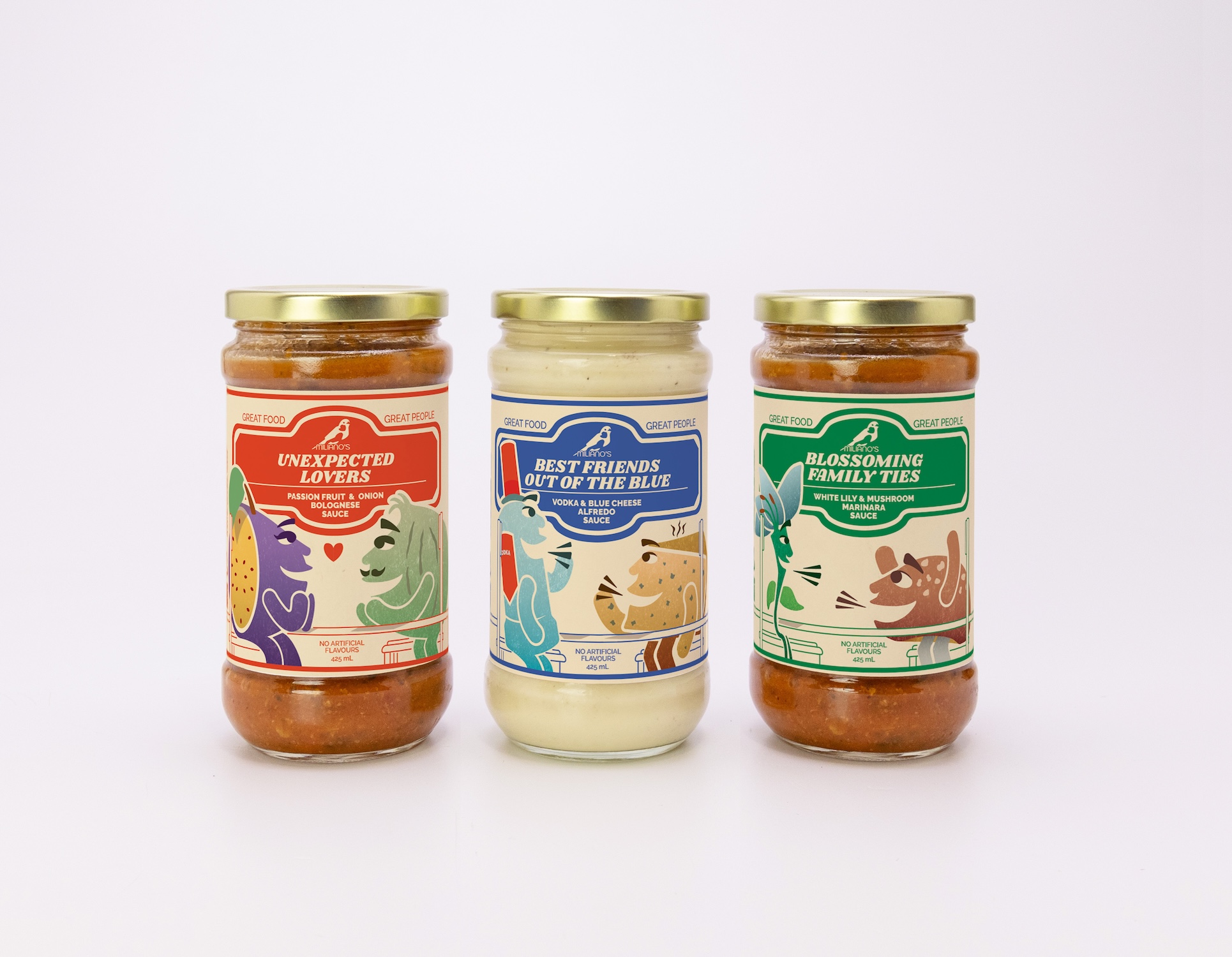
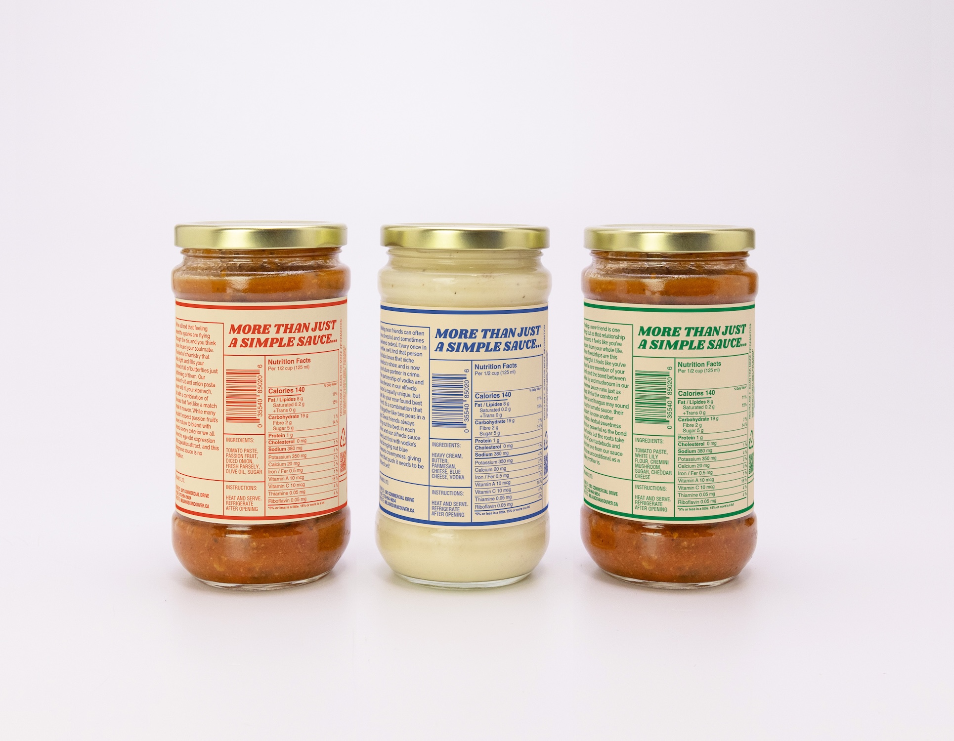
iii. Packaging
The in-restaurant pasta sauce trio brings together unexpected ingredient pairings that work perfectly—just like the unlikely people sharing the long table, where your perfect pairing might be a stranger across from you.